
Email Marketing Responsive Design Drives More Results


Marketers are beginning to learn how to be more clever and refined with their marketing approaches. Recently, they have learned how to integrate responsive web design into their mobile marketing strategies to better benefit their email marketing. Mobile email has been a big subject for marketers in 2013 since mobile rates are continuing to rise. So to take advantage of this, the idea to incorporate RWD to drive mobile results came to the forefront.
“A lot of effort is now going in to make sure users can scan and click on the email when it’s on the small screen. If it takes a user to pinch or zoom to see the email, forget it; they’re gone,” stated Matt Caldwell, Vice President of creative and agency services at Yesmail Interactive. “So one area of increased sophistication is in message design and coding.”
He also said “responsive email design is probably the best example of increased sophistication” and that “responsive coding and design of email can be complicated and time-consuming, but because of this surging open on a mobile, we see many if not all, of our clients want to do it. Why? It will alter the email layout to a true mobile design when opened on mobile.”
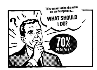
A majority of companies will see more than half of their commercial emails opened on mobile devices in 2013. This is according to a recent study done by Knotice. Even in light of this, Yesmail discovered that several mobile marketers are still not formatting their email correctly for mobile devices, even through their is a definite rise in email openings through mobile. In fact, it was discovered that in their survey of over 65 marketers over 6 months, Yesmail found that only 14 of 65 companies had correctly formatted their emails for mobile. Mr. Caldwell explained, “Our test was, ‘when opened on the mobile device, can I read every word and click on every link without having to adjust the email layout to make it bigger’? So we’re still seeing many email marketers are ignoring this important aspect of email; how to design and code it.”
Yesmail recognizes several ways for marketers to improve their email layouts to drive up open rates, drive up click through rates, and increase ROI. Marketers can use scalable hybrid layouts, so there’s one layout that will fit both big and small screens equally. They can also pull and link social content like tweets, photos, and comments into their messages. Yesmail also suggests incorporating a catch-all bottom navigation format to push clicks through to other category levels with a series of links at the bottom. Of course, it’s imperative to remember to include mobile call-to-actions in your emails. This is what will drive users to engage with your content.
Yesmail also recommends that marketers jump in and attempt to try to at least incorporate either scalable or responsive email design into their marketing strategy. Sometimes it’s even possible to do both.
“Scalable means ‘the pumped up layout’; you keep your message with the same 600 pixels but you pump up your type, to a minimum 14 points, and you pump up your buttons,” said Caldwell. “Why make it bigger? Because when the layout is reduced to have its size on the phone it can still be read and clicked.”
Caldwell then explained responsive email design, “Responsive is using media queries to make your HTML email device aware. When it’s opened on a small screen, it will load a different set of styles that can resize, reformat, and delete to make a true mobile layout.”
If you observe the Knotice data, you’ll notice that emails are not being viewed on multiple devices. This means that if someone opens up an email on their cell phone or tablet, then the odds of them opening that same email later on their desktop back at home is very unlikely. This only highlights the fact that marketers need to integrate a mobile email strategy into their mobile marketing strategy that does not end up rendering poorly on mobile devices.
Responsive design is great, but according to Knotice, it does not address issues like matching performance levels on PCs.
Patti Renner, Director of Marketing at Knotice, pointed out, “One trend marketers are now using to address this is responsive design for email. This format strategy incorporates multiple content options built into the email, with the ability to adjust the email images and content served based on the size of the viewport when opened. This format strategy incorporates multiple content options built into the email,” she continued. “With the ability to adjust the email images and content served based on the size of the viewport when opened. While this is getting some buzz as a cure-all for dealing with device proliferation amongst consumers, responsive design is no silver bullet. Even the best responsive design on mobile may not match performance levels on PC.
“And it may not render as well on Android as it does on iPhone. Mobile optimization requires marketers to be open to testing, adjusting, testing, and then testing again to get it right for the audience”, Renner concluded.
It is also important for marketers to be aware of click activity across multiple channels at once. This is a great way to find out how people are engaging with your emails once they’ve opened them.
As of right now, click activity is still stronger on PCs and desktops as opposed to mobile devices. This will change when marketers start to send more mobile-friendly emails.
“The simple fact that click activity remains so much stronger on PC and desktop as compared to phone or tablet will likely shift when predictive design methodology is used; anticipating the device used based on a past history of email activity for that device, for that individual and designing around that.
“This is the trend we see coming for marketers; using your data for mobile optimization, while understanding individuals and the devices they use for the best mobile experience possible,” Renner concluded.


Leave a Reply
Want to join the discussion?Feel free to contribute!